Brian Levy
UX, UI, Interaction, & Graphic Design
Get in touch
uxWork
Azure Cloudfit
Tracking and managing Azure subscription costs
Internal teams building software on the Azure platform often are not aware of cost inefficiencies with their Azure resources. Making internal services more efficient frees up Azure resources for paying customers. The existing app to track Azure usage was cumbersome in performance and overly complex in data display making it difficult to identify areas of cost savings. “I don’t want to just spit out a database into a table” was one of the first things the project lead told me when I came on to the project. Having read Just Enough Research by Erika Hall, he had developed a set of basic personas and scenarios and was committed to a user centered design approach. Every decision was in service to our personas. Before a single screen was designed, I threw myself into a crash course on Azure resources and usage. My first step was to sort through, understand, and define all the data that the underlying back end could potentially retrieve. I then started to identify the key pieces of information that were the most useful to our users and putting aside data that did not add value or help the end user make a decision or take an action. Every piece of data had to justify its place in the interface. Working in rapid iterations to expolore and validate as many ideas as possible, I started exploring different navigational models, information visualizations, and interactions. Every step often presented more questions than answers. Starting with a mobile-first approach forced me to focus on the most essential information. I created simple interactive prototypes to help get a feel for how the app would flow. We used these quick protoypes to do quick user tests to see if we were on the right track. These tests often revealed ideas to explore. Once the site structure was defined, I created HTMl/CSS templates to help the development team in implementation. Instead of re-designing or re-skinning the old system. A new product was built from the ground up creating a responsive, performant app. The user is presented with data that is relevant to them. Content is focused on identifying areas of savings.Problem
The process
Solution
My role
Shows aggregate data for all of a user's Azure services
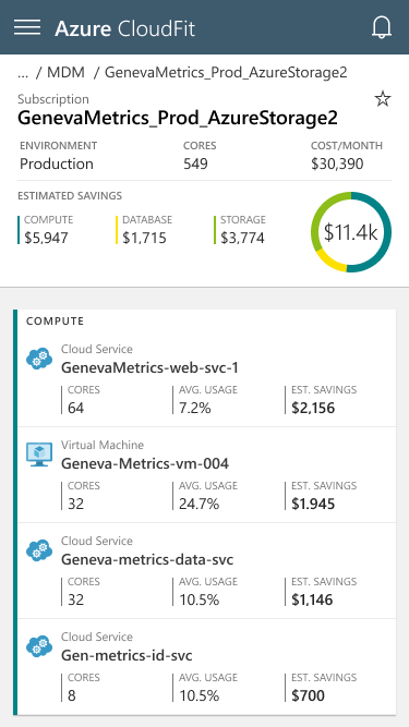
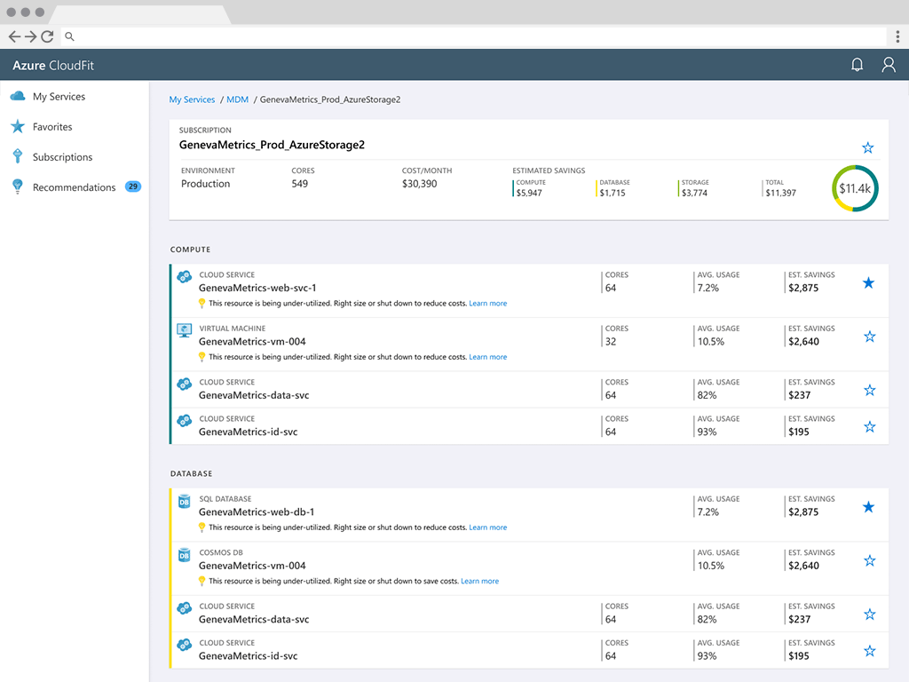
Each level reveals more detail. This view shows data for an individual service
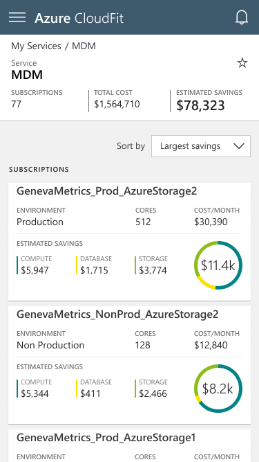
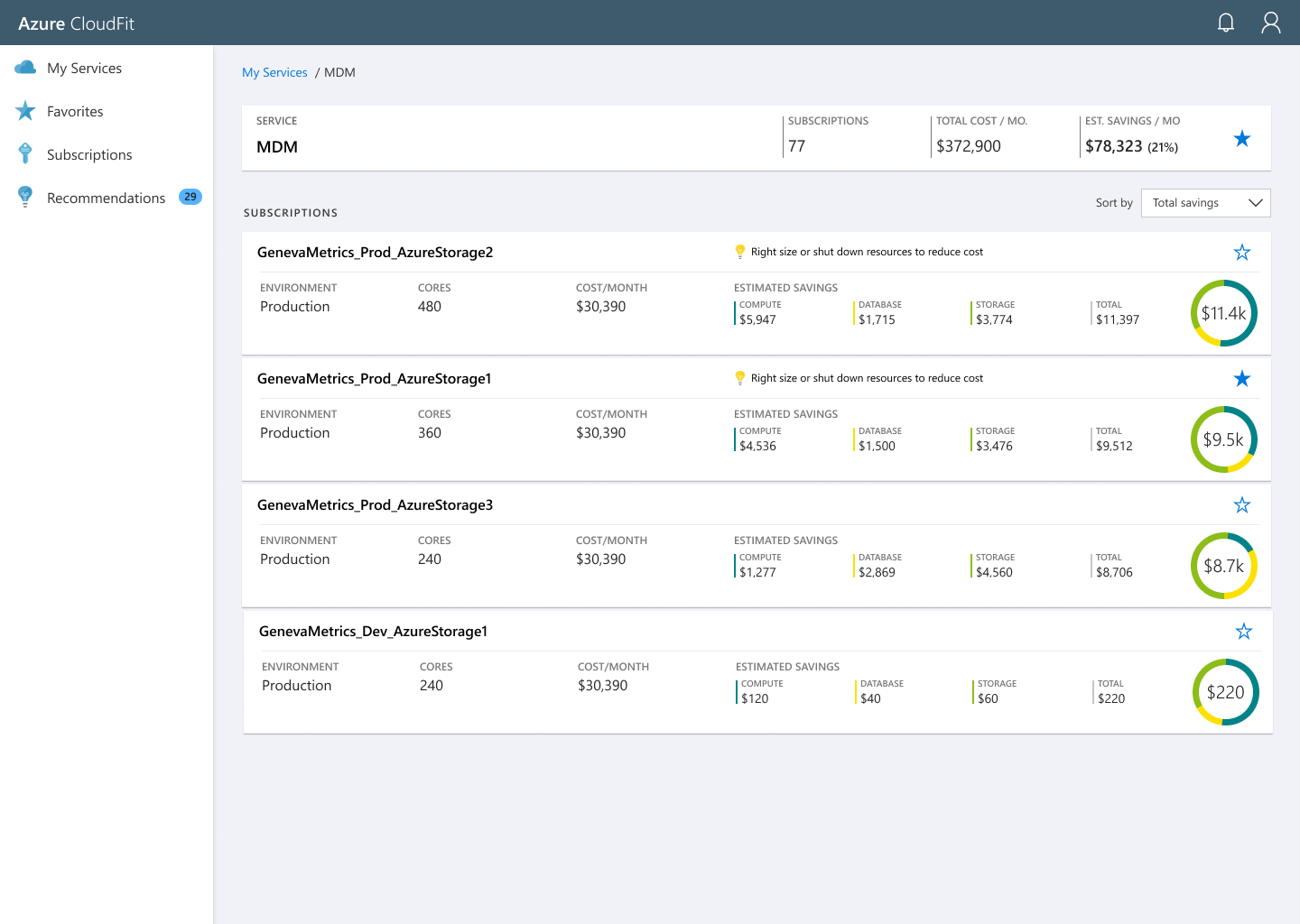
Going deeper reveals more granular data for an Azure subscription
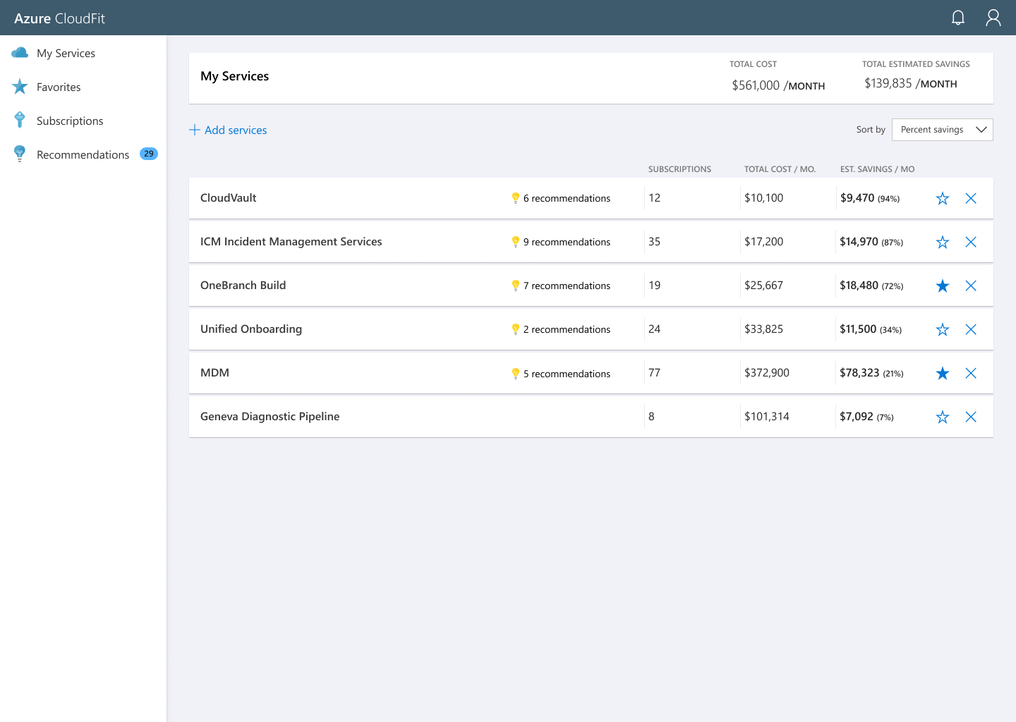
Top level view
Service overview

Subscription overview